Tricia Strickfaden is an abstract expressionist modern artist who moved to California at 21 and started painting professionally in 2000. Tricia’s design background and her surroundings influence the vibrant colors in her pieces which have been shown at local charity auctions, art fairs, and galleries across the US. Her work has also been featured in magazines including Coastal Living and South Bay Magazine.
In this interview Tricia shares about what inspires her, the color palettes she finds herself drawn to, and how she went from the interior design field to working as a professional artist.
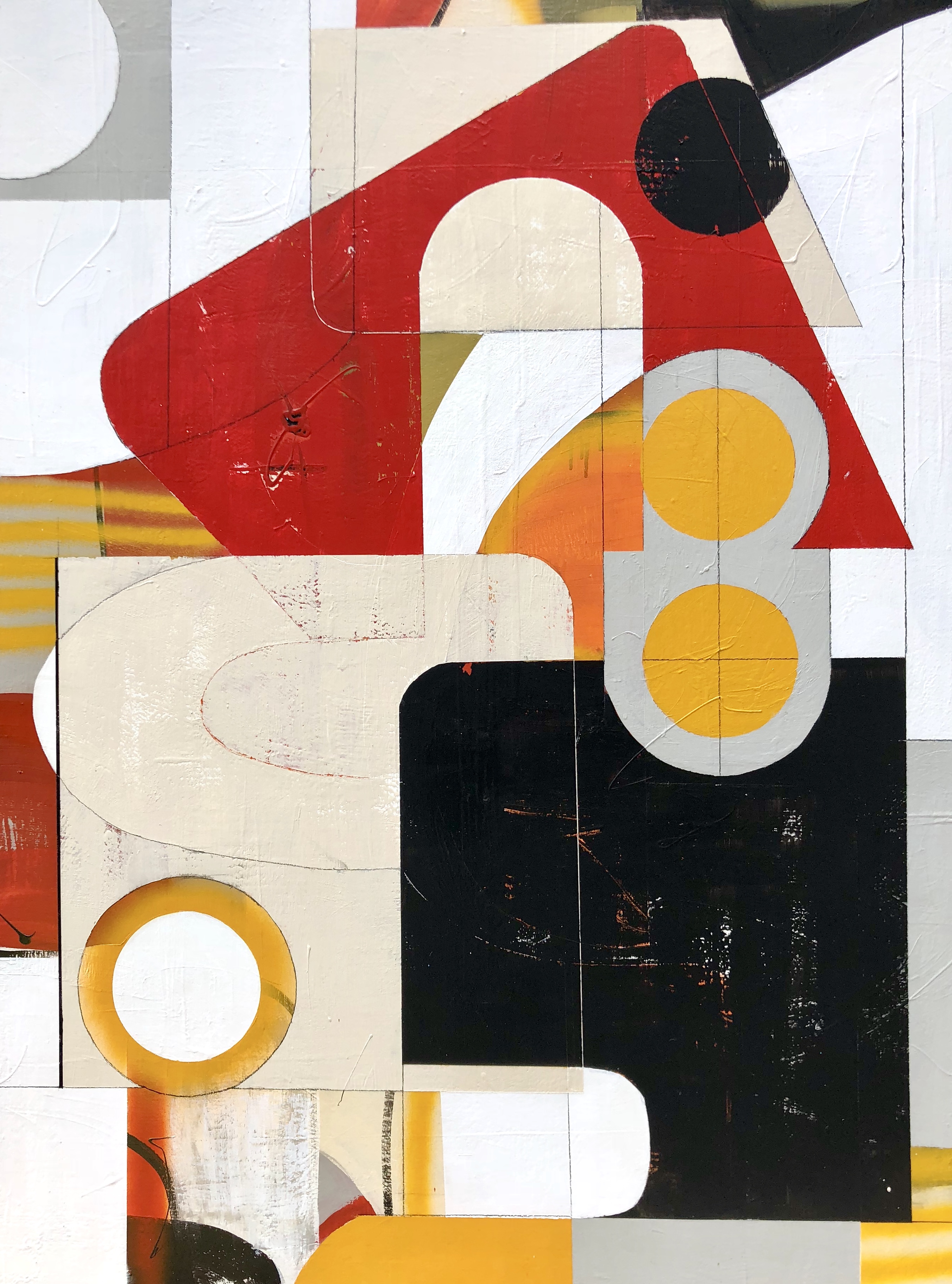
Can You Dig It | Urban Organics Retro Series
You studied Interior Design at Stephen F. Austin State University. When did your love of art & design begin?
My love of art started at a very young age. As a child, I would immerse myself in art drawings for hours teaching myself to draw by copying photographs and sketches from art books. I took Fashion Design and Merchandising classes in high school but realized this was not the career path for me. Instead, I took an Interior Design class Freshman year in college and was hooked. My obsession with design and interiors began. I minored in Fine Art, taking everything from painting to sculpture, and that art background enhanced my abilities as a designer.
How did moving to LA influence your artistic style?
I moved to the LA area at age 21 and was working in the commercial interior design industry for 10 years. I began painting again in my early 30s after the birth of my daughter. An evening oil painting class at a local community college helped get me back to my artistic roots. I continued to work in residential interior design for another 10 years while continuing to reach and evolve as an artist and building a following. Living at the beach had a great influence on both my abstract landscape series and botanical works. I draw inspiration from the colors of the ocean and landscape and interpret them in modern abstract form on the canvas. LA’s hip, urban, yet fresh and casual lifestyle would have a profound effect on my more modern art later in my career.
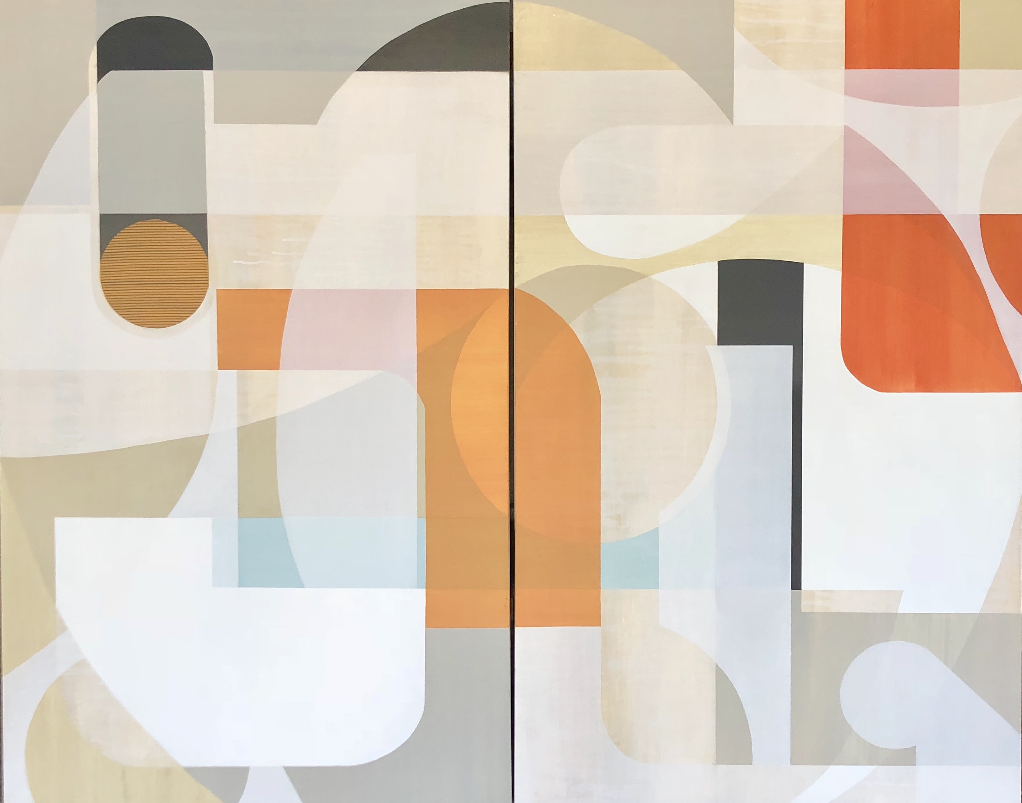
Hollywood Hills and the Blvd Diptych
You use colorful palettes and implement line, shape, and form into your work. What is the color palette that you feel drawn to the most?
The color palettes are continually evolving. In my abstract botanical work, blues, Aquas, teals, and greens often dominate, because it’s organic and inspired by living by the coast. In the Urban Organics pieces, I find I am drawn to the warmer palettes, and the Palm Springs post-modern/mid-century influences that give it its hip, urban feel. My favorite color of the moment is a spicy orange.
To create your pieces you used a combination of recycled house paint, ink, and pastel, and/or charcoal on canvas. What drew you to using these particular mediums?
I try to be creative in the materials I use, so it’s not just one medium. It makes the work more interesting and alive with color and texture. I prep the canvas with a thick acrylic medium to add body to the canvas, and provide initial texture. The inks, pastel, and charcoal details enhance color or define edges, making certain elements pop on the canvas. The recycled house paints are just that.. paints I had leftover from numerous design projects. I just gave them another more artistic life.
What is your greatest source of inspiration?
I find inspiration everywhere in art, design, and architecture, and everyday life. Modern masters such as Picasso, Pollock, and Rothko, and many others, as well as current modern artists I follow on social media, have been greatly influential. As a former interior designer, I keep up with current design trends and color palettes. I have a list of favorite designers I follow who give me color and style inspiration. My personal taste in style and design has evolved over the years as well, and I see that evolution reflected in my paintings. I am loving the current modern minimalist and mid-century trend in interiors right now, both of which definitively influenced my newest Urban Organics series.
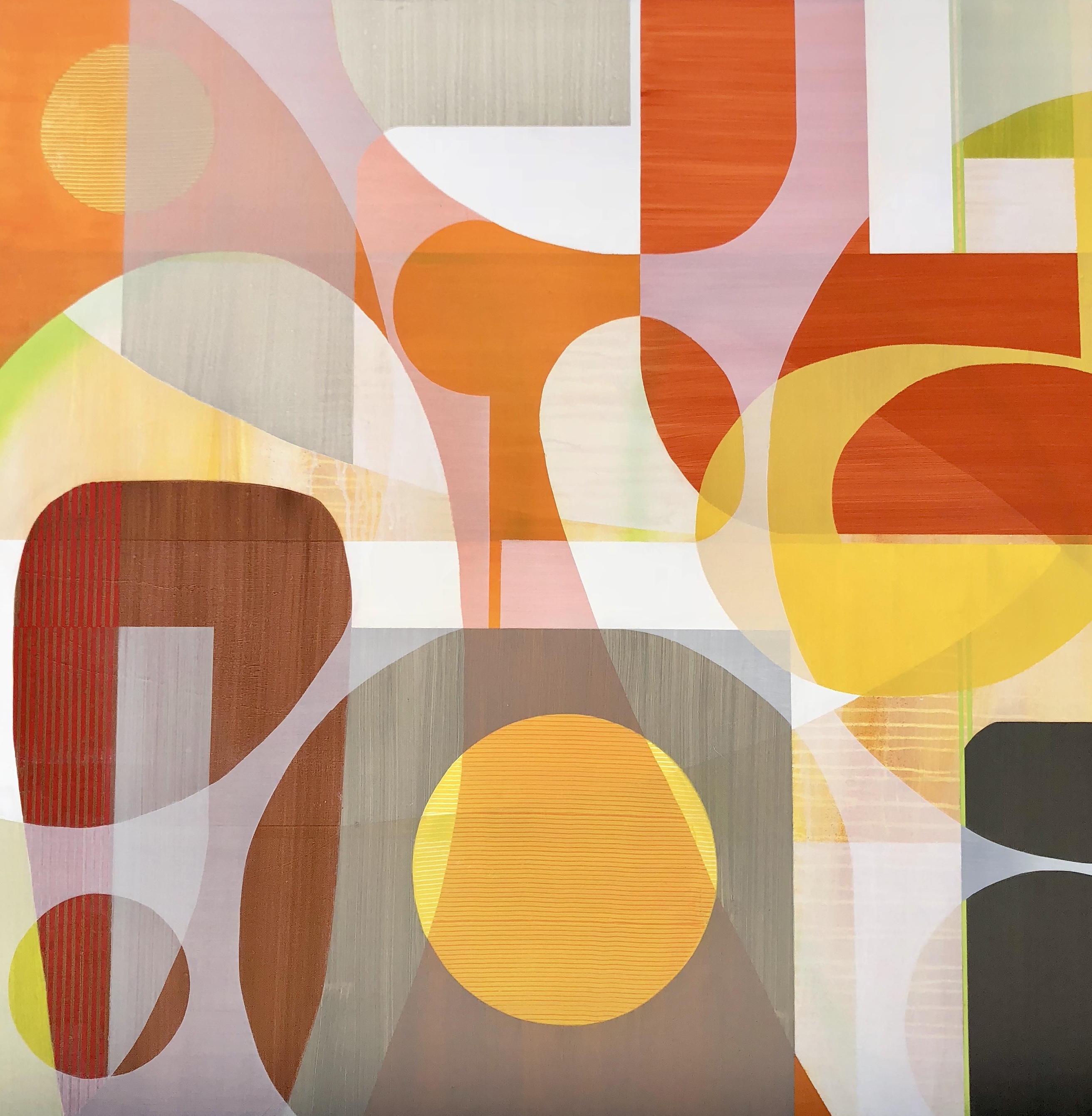
No One Walks in LA | Urban Organics
Tell me about a typical day in the studio.
I don’t paint every day. I have to have the creative inspiration to get in the studio, and it goes in spurts. When I’m on a roll with several pieces I spend weeks at a time in the studio. Other times, I won’t paint for a couple of weeks or longer, spending that time thinking about the next piece, researching ideas, and marketing current work. In the studio, I tend to work on several pieces at once, painting with similar color palettes, so they could be easily purchased together. As one piece is drying, I hop back and forth between several others in varying stages of completion. My studio is a complete mess while I’m working and I never feel I have enough workspace. When I can’t take it anymore I clean up, put things away and get everything completely organized. It helps me regroup and continue the creative process.
Your work was displayed at the 2013 Coastal Living Showhouse in Daniel Island. What was it liked seeing your work published in Coastal Living?
Incredibly exciting! I just love that part of the country and would like to retire there someday! I actually flew to South Carolina with my family and toured the Coastal Living Showhouse at Daniel Island. It was so fun, and the house was absolutely stunning. I was painting abstract landscapes during that period, and the low country and inter-coastal waterways gave me the vision for an entire series of paintings.
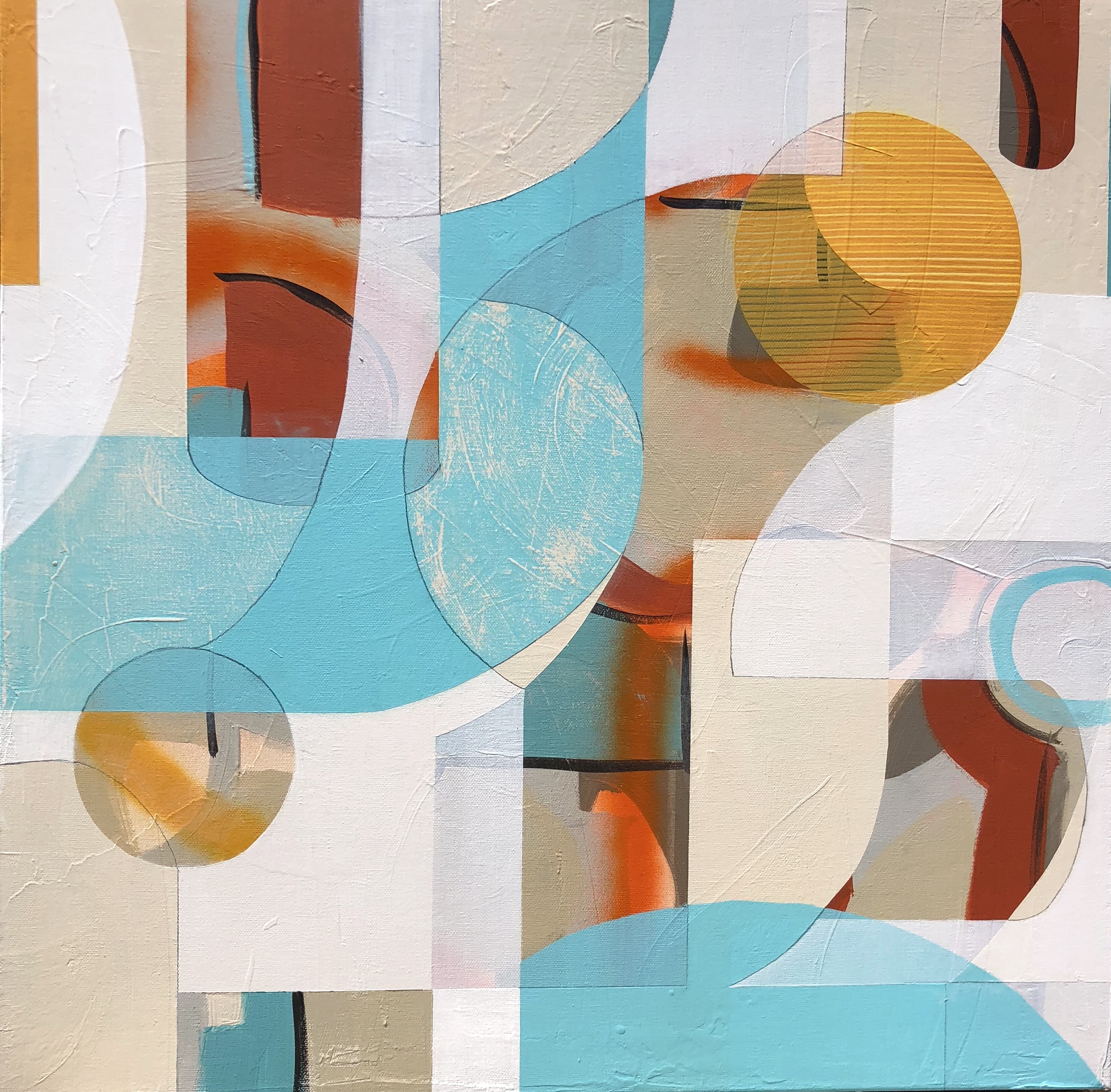
Study #1 | Urban Organics Retro Series
What is the largest piece you’ve created?
So far 48×72. I would like to go larger, but I’m limited by my current studio space. To accommodate larger sizes I’ll often do diptychs or triptychs.
Out of the three collections (Urban Organics, Abstract Botanicals, Black & Whites) which one was the most fun to create?
I have loved creating each of my series. The Urban Organics are so fun. While my botanicals and black and white series evolved organically and spontaneously, the Urban Organics requires more precise thought and planning. I do preliminary sketches before I starting a piece. After prepping the canvas, I begin the work with a dripped and/or gestured underpainting, before overlaying the modern shapes. I may edit, evolve and change from the original sketch as needed, but I start with an initial game plan. It’s created with many layers of detailed work, allowing translucent and opaque shapes to overlap, push behind and pull forward, making the composition interesting and dynamic. Often times the work ends up looking very similar to the sketch, other times it becomes entirely different and emerges as something completely unexpected. It’s the “happy accidents” that occur that make the work so refreshing and real. It’s that process that defines me as an artist.
Even though I tend to evolve my work in seemingly varied series, originally starting with Abstract Landscapes, to the Botanicals series, to the Black & Whites and Urban Organics, all have a common thread. Color palettes inspired by the earthy California coast and landscape, with organic gestured forms, are woven into modern often minimalistic abstract forms.
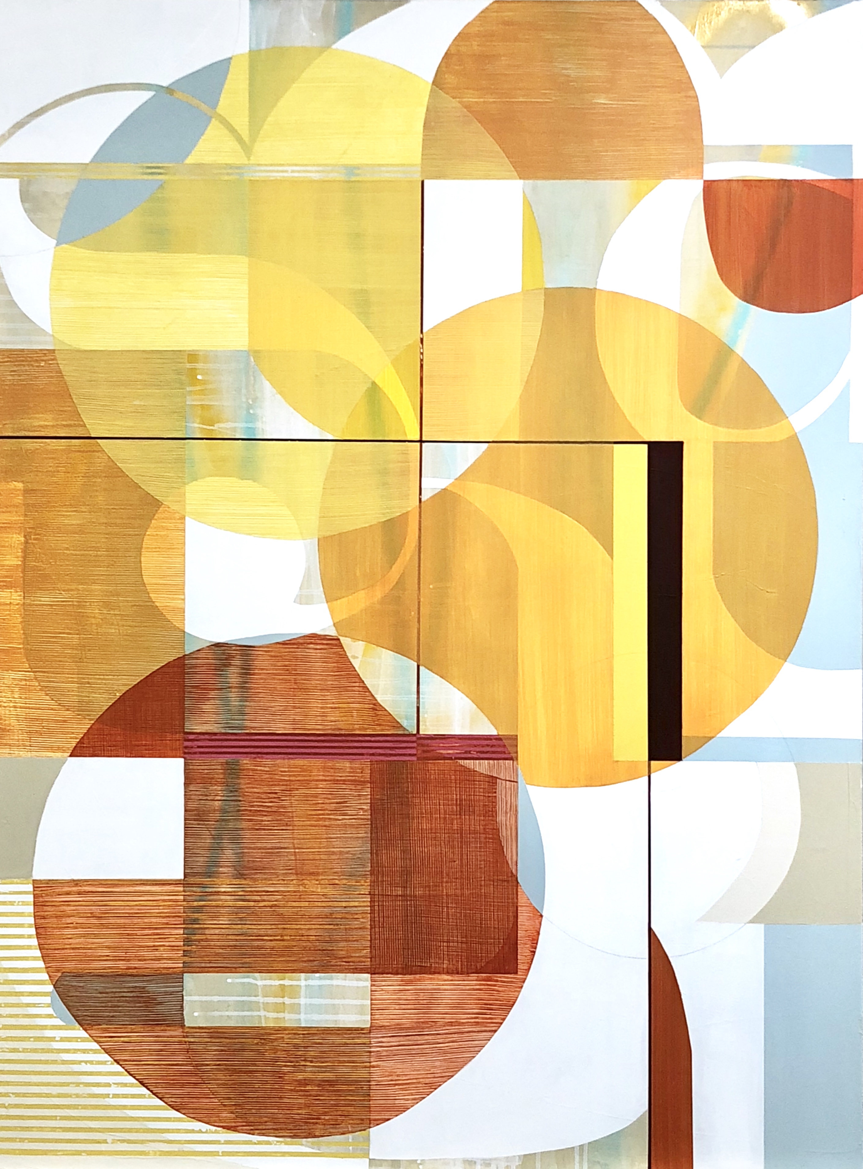
Sunny Day in LA | Urban Organics
Website: https://www.tsmodernart.com // Instagram: @tsmodernart // Facebook: TS ModernArt Studio // Twitter: @tsmodernart
All of the photos in this post are via Tricia Strickfaden and are part of her Urban Organics collection.


Great interview!
Wonderful interview. I enjoyed every line!