Photo credit | Kate Berry
“I have always loved modern and early contemporary art, it’s just the spirit of art itself that really drives me. It feels secretive, special, sensual, serious, and timeless.”
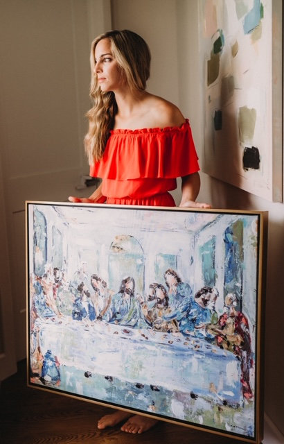
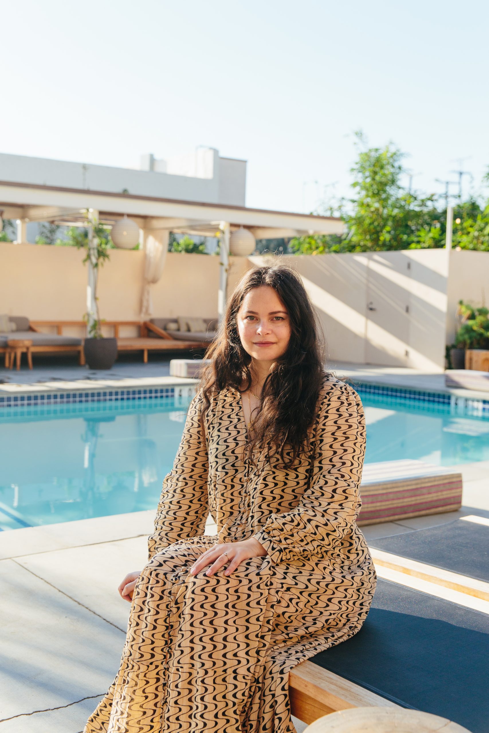
One of the things that has always drawn me to art is the use of color and artist Marleigh Culver paints with such an array of brilliant colors. Marleigh’s love of the art and graphic design began in her teens and she’s worked for brands such as Coach, Nike, Google, Gap, Madewell.
In this interview she shares about the color palette she’s currently drawn to, what it was like getting her first big freelance project with Teen Vogue, her love of creating large scale work and more.
When did you first become interested in art and design?
It’s been ingrained in me since I was young. I’ve always loved looking at catalogues and magazines for fashion, interior design and contemporary and modern art museums. My parents are both creatively-inclined, my mom was going to college for art and design when I was young. I think I just was born with a creative energy that hasn’t stopped. I knew I wanted to be a graphic designer and artist when I was a pre-teen, I just love expression and visual art and the power of viewing and feeling it.
One of the things that has always drawn me to art is the use of color. What is one of the color palettes that you are most drawn to right now?
My color palettes are pretty organic, I do use some of the same palettes over and over, but at the moment I’ve been experimenting with natural and neutral colors like coffee-colored browns, cement-ish grays, and I always love a deep mustard-green. I’m trying to find more serious color palettes that give more weight to my work. I’ve been working in more blues as well since it’s such a vast color group.
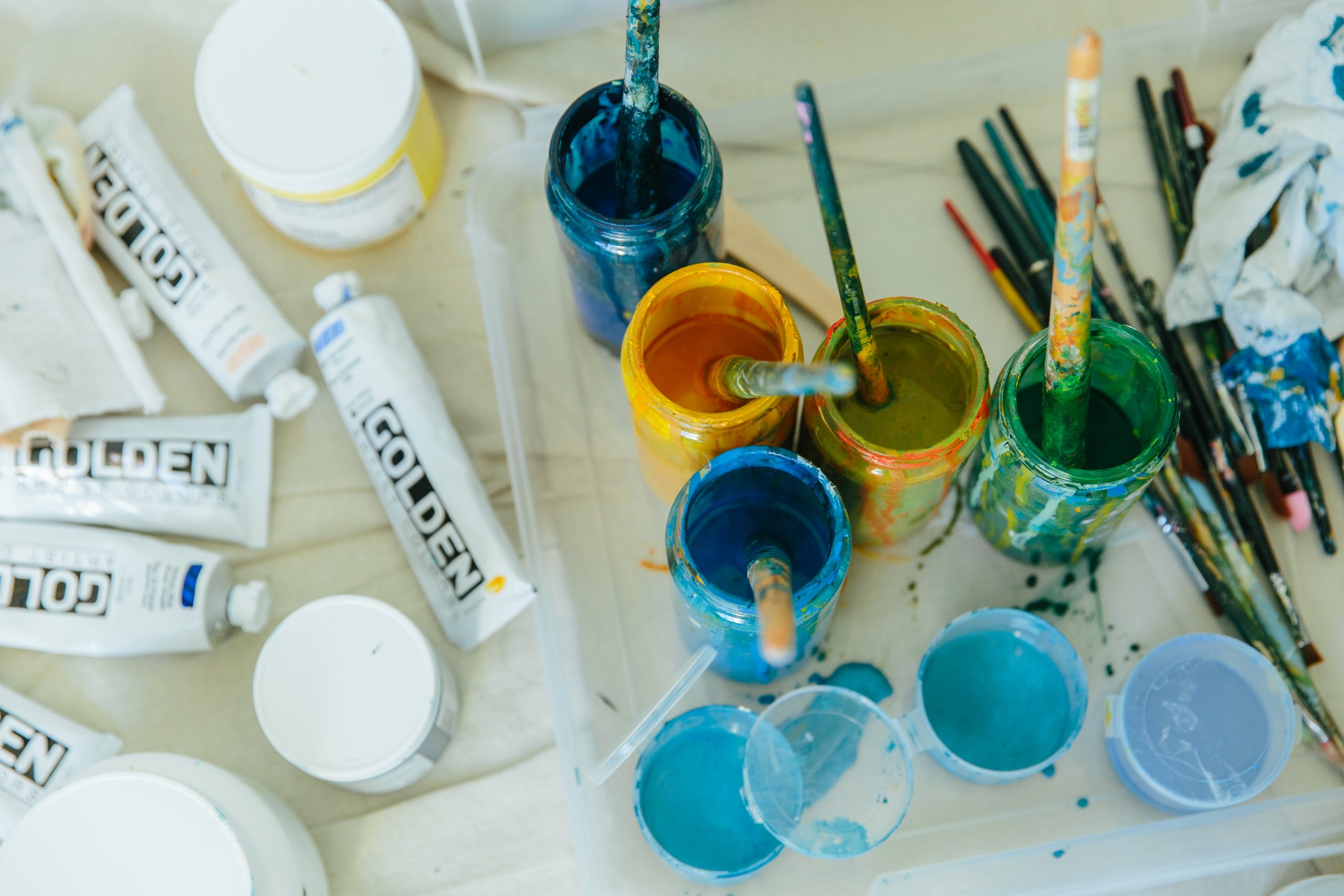
Photo credit | Kate Berry
What is your greatest source of inspiration?
I think just being in love with any oversized large abstract paintings when I was younger. I love the intensity of something color-focused and very impactful through shapes of paint and canvas size. I have always loved modern and early contemporary art, it’s just the spirit of art itself that really drives me. It feels secretive, special, sensual, serious, and timeless.
Tell me about a typical day in the studio.
I do a lot of design work in order to fund my art practice. I sketch a lot on the computer and choose colors by mixing my own paint and testing them out on canvas scraps. My partner built a workshop so we can build stretched canvas and floating frames now. It’s really nice because he has something physical to do and so do I. We both work jobs for e-comm so it’s so pleasant to get a break from a screen and do our own things. My painting sessions are accompanied by music and are always on the timeline of what the sun is doing.
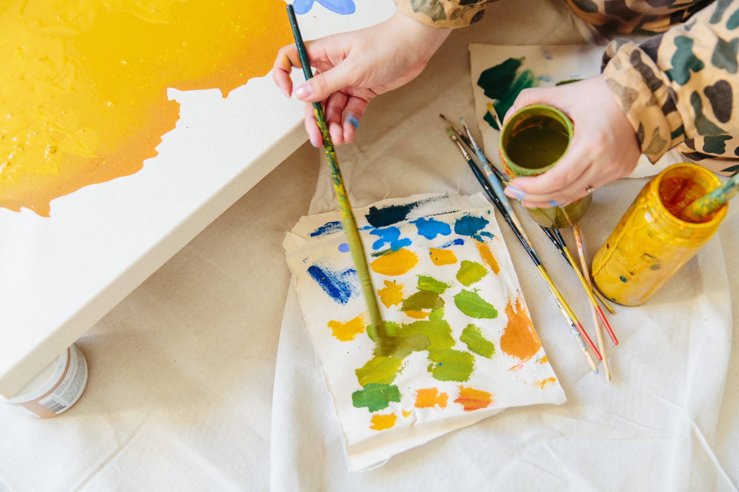
Photo credit | Kate Berry
What is the project you are working on right now?
I’m working on a personal commission, and commissions for spaces through my representation at Tappan Collective. Other than that, secret design projects, branding, and just working through building a brand creatively in the food space. I want to make more paintings in 2021. I had really grand plans for this year and all the work I was going to make, but this year has been honestly just terrible in so many ways. I’ve never felt more frantic, stressed, confused and like I’m not good enough. I had to focus on solely just making money to get bills paid and to make a huge move across the country. I just continue to work hard to get to a place where I’m always doing something the way I want to and to produce more physical items.
Your first large freelance project for Teen Vogue. What was the most exciting part about this first big project as a designer and as an artist?
I just felt so surprised that my work on Tumblr was noticed. I also just love the mysticism and symbols with horoscopes and zodiac subjects. It was a unique project, making illustrations that represented the zodiac signs, it’s something I like to study about people, so I brought in all the aspects that reminded me of those signs, and assigned special colors to them. It’s a different style of mine but something I’d love to do again or explore more of.
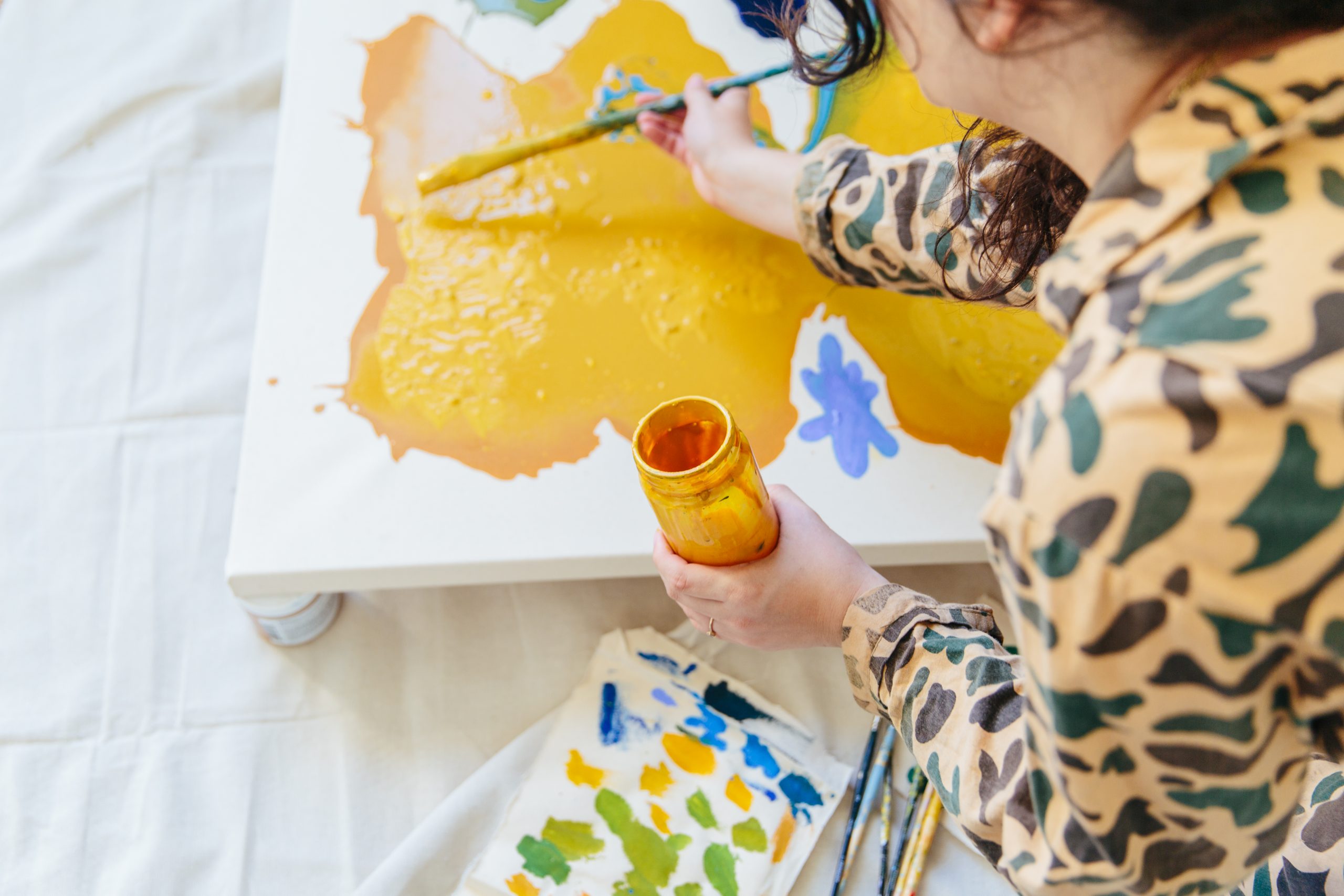
Photo credit | Kate Berry
One of your recent collaborations was with California based olive oil company Brightland where you created a label for their Ardor olive oil as part of their Artist Collection. What did you enjoy the most about working with the brand?
I was excited about this one because the founder Aishwarya is just really cool and has built a wonderful brand around one special product. I was dying to make something in the food space, we had chatted once about making a label together and it didn’t happen, but then when she approached me for this one it was perfect because spice is a huge part of my food-related upbringing, it just reminded me of my grandma’s house, she’s Thai and always has baskets and baskets of her chili peppers drying and growing in the garden. I love spice as an element in food and to symbolize my label it was about the spread and tingling of spice as well as that first initial hit on your tongue.
Your Past Mural Clients include: Wild One, Lalo, Sweetgreen, Columbia Care, Serea, Google and Indeed NYC. From going over the concept with the client to finishing the mural, how long is the process, and what has been one of your favorite murals you’ve created so far?
The process can be short or very long depending. Projects can be turned around in days or months. The mural depends on the space to be planned out and the surrounding objects and colors to be solidified. Murals are like a response to where they live. I sketch and mockup the designs in the space, and the client and I edit or decide what direction, then I paint. It’s a laborious practice but one I love. I usually have my fiancé, friends or family help me paint. It’s very personal to me, I have people ask to assist me but I just don’t feel comfortable. It’s way more than an act of painting a wall. It’s about taking something very special and blowing it up really big and it’s such a vulnerable feeling. One of my favorite murals so far has been Sweetgreen, I don’t think it’s up anymore because I tried to look for it, I hope it is. But it was one of my favorite color palettes and where I was exploring with shapes. I really loved it.
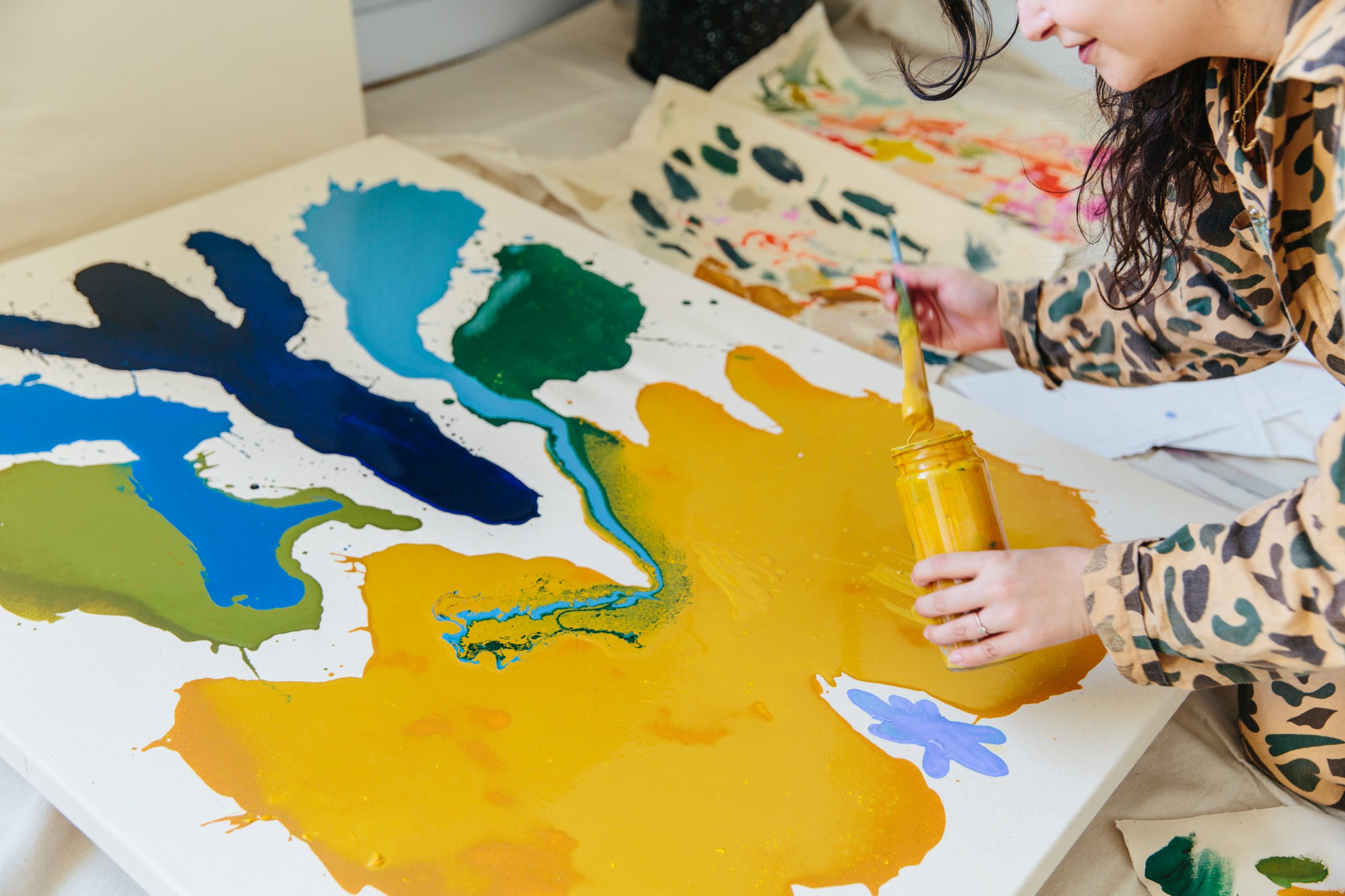
Photo credit | Kate Berry
In addition to your artwork on canvas you also create large murals. Do you prefer working on a small or large scale?
I’m definitely a large scale person. I’m somewhat reserved/private as much as I share a lot on social media. I have a lot of thoughts and direction I keep quiet. I love my space and alone time. I’m introverted. So painting large is like a challenge to that. A challenge to myself and my personal output. The size and immensity of a mural matches my inside which I can’t do any other way.
A few of your visual design and art direction projects include Coach’s Art of Signature. The Nike SB Spring Collection and Fella Swim. What was it like seeing your artwork translated beyond the canvas?
Just so amazing. I love making physical objects so much, I wish I could do more but those things take a lot of communication to manufacturers and money. I just love seeing my work be alive in a space and would love to move into tiles, more organic murals maybe over fireplaces, pools, tables, etc. I want my work to live on everything. I have worked in fashion and e-comm so seeing my work on Coach and Nike and Fella was so surreal. Working with people on projects like this is such a privelege, especially since I get to do the fun part!
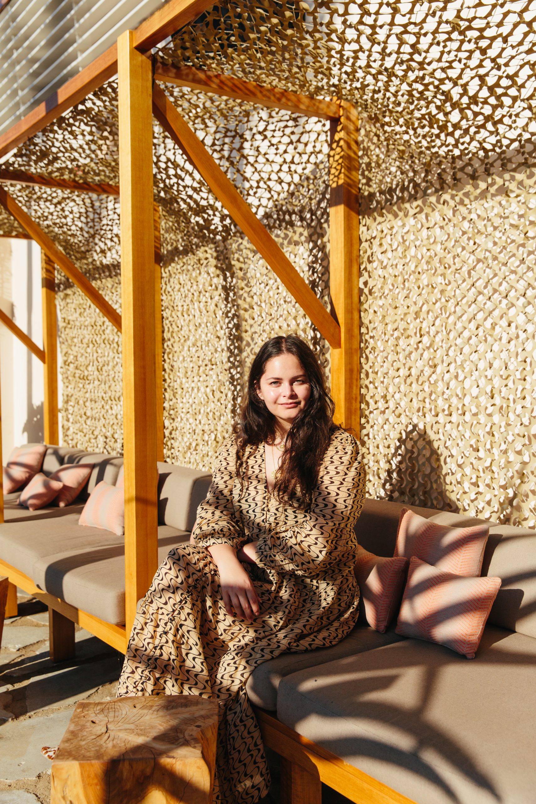
Photo credit | Kate Berry
Keep up with Marleigh on her website and via Instagram @marleighculver
